
Background
The ‘action’ component of ‘participatory action research’ often encompasses critique related to public policies (Torre et al., 2012). As policies construct our health and social systems, improving the well-being of citizens involves ensuring these policies are reflective of the realities of how these policies are experienced and enacted. Transforming policy can therefore be a critical social action (McTaggart et al., 2016) elevating knowledge from lived experience to have a structural impact. However, within these aspirations are myriad complexities, particularly if trying to situate policy analysis within the constraints of academic research. In this paper we present one means of using arts within a participatory action research (PAR) project to optimize critical and complex policy analysis. In particular, we used graphic recording and the illustration of graphical frameworks as both a process and a product of PAR. Graphic recording is the process whereby an illustrator develops an image in real-time to capture conversation or ideas, often used as a more interactive way to record meeting notes or receive feedback (Kennedy, 2018). By graphical frameworks, we refer to images that an illustrator has designed to present a conceptual structure, in our case a secondary product from graphic recordings.
The overall goal of the project was to create an evidence-based and just framework for preventing and ending homelessness, initially within the provincial context of Ontario but expanding to be applicable to Canada more generally. Homelessness is a complex health and social challenge involving anything from the micro, such as familial conflicts, to the macro, such as poverty (Oudshoorn et al., 2020). And in thinking about the policies and systems involved, many different public sector silos are implicated, such as social income, housing, healthcare, justice, education, employment, etc. For the purposes of this paper we use the Canadian definition of homelessness, which includes but is not limited to street/absolute homelessness, recognizing also unsheltered homelessness, precarious housing, and those at imminent risk of homelessness (Gaetz et al., 2012). The motivation for this study was a frustration with a continued micro, and at most meso-level, focus on ‘solutions’ to homelessness in Canada. Historically conservative perspectives situated both the cause of and the solution to homelessness within the individual or family unit (Baumgartner et al., 2012), seeing, for example, addiction as a personal failure, as the cause of homelessness, and therefore treatment as the solution. If homelessness was due to personal shortcomings, then the solution was simply correctives at the level of the individual such as employment, treatment, or behavioural change (Parsell & Parsell, 2012).
This narrative was confronted and subsequently elevated by the transition to speaking of and implementing ‘Housing First’. Housing First is both a philosophy and a service approach (Gaetz et al., 2013) whereby it has been demonstrated via research that the solution to homelessness is housing, and that housing needs to be rapid, free of conditions, and inclusive of supports where necessary (Aubry et al., 2015). Housing First confronted individualistic narratives by noting that mental illness and addictions, to name two factors, do not cause homelessness but rather, lack of housing causes homelessness and housing therefore is the remedy. Early advocates and subsequent evaluations of Housing First programs have shown that no individual is ‘unhouseable’, rather, with housing that is truly affordable and with the necessary supports, all people can find a home and live stably in that home (Woodhall-Melnik & Dunn, 2016). Housing First has seen success globally wherever it has been implemented (Baxter et al., 2019; Kertesz & Johnson, 2017; Peng et al., 2020), with many individuals who were formerly chronically homeless becoming successfully permanently housed.
However, in spite of these individual level successes, Housing First has failed to scale even in countries where it has been the most comprehensively enacted, such as Finland (Y-Saatio, 2025). Years of success have been followed by retraction as public sectors have been unable to adequately provide one or both of: 1) Deeply affordable housing, meaning affordable to those on the minimum social assistance income; and 2) Adequate supports, meaning health and social care as required for those who need assistance to live independently. It has become a growing refrain within the sector that, “You can’t do Housing First with no housing” (Hancock, 2022). Therefore, a meso-level approach is an improvement over prior micro-level analyses, but yet has not been sufficiently macro to actually prevent and end homelessness. In this context our research team set out to ask the question of, “What would it take to truly prevent and end homelessness in Canada?” As academics with the luxury to ask complex, political, and difficult questions, we felt it was necessary for us to lay out a broader vision than was being spoken about both within the halls of service providers and within the world of policy-making. We framed our first follow-up question to participants less academically as, “No, but really, to actually end homelessness…for real?”
Study Context and the Challenge
Participatory visual methods are well established within qualitative research, with reviews and frameworks describing visual tools as accepted and increasingly used approaches across disciplines to both capture complex data and present it (Glaw et al., 2017; Glegg, 2018; Page et al., 2022; Pain, 2012; Trombeta & Cox, 2022). Within the breadth of approaches, visual scribing, graphic facilitation, and graphic recording are live recording methods used to document meetings, events, capture visual minutes, or illustrate group processes (Bratun et al., 2025; Mendonça, 2016). Visual approaches are also deployed, usually towards project completion, to illustrate and disseminate findings from visual abstracts to visual storytelling including to the purpose of increasing accessibility of project findings in graphic formats for various audiences (Bauer & Sippel, 2024; Botsis et al., 2020; Ibrahim, 2017). These illustrative approaches provide knowledge artifacts from relationship maps, to timelines, to frameworks and models, that both integrate stories of participants and present study findings/outcomes (Bagnoli, 2009; Bravington & King, 2018; Copeland & Agosto, 2012; McAra, 2019). However, while visual methods are most often used to capture data or present it, less studies or methodological pieces have presented graphic methods as an interactive, ongoing component of data analysis itself, meaning there is an interactive process whereby the illustrations themselves become a form of data, advancing the analysis.
Visualization and graphic illustration remain underutilized as a method beyond notetaking and presentation of findings (Jiang et al., 2023). The majority of current illustrations present themes, models, and frameworks with no subsequent engagement as analysis of these illustrations (Verdinelli & Scagnoli, 2013). Sturdee (2025) has recommended that similar guidance needs to be developed for the use of visual methods that exists for other forms of established qualitative analysis such as thematic analysis or narrative analysis. As such, the reflexive and epistemic potential of visual methods as largely unrealized (Bauer & Sippel, 2024), or at least is rarely described if being used. Entering into the work of complex policy analysis, we both anticipated some value of visual methods but the utilization and value of the method extended as the project unfolded.
For our project, we assembled a very large research team. As a PAR project, we wanted to ensure that the roles represented by participants were also represented on leadership of the research (Baum et al., 2006). Therefore, our project team consisted of: 1) Academics; 2) People with lived or living experiences of homelessness; 3) Service providers; 4) Activists; and 5) Policy-makers or those implementing public policies. These team members co-designed data collection guides, recruited participants, facilitated focus groups, reviewed data, co-wrote analysis, and disseminated the results within their local communities and networks. In this way, those invested in the results of the project (including both service providers and service recipients) were also equal participants in collecting the data, undertaking the analysis, and disseminating the results. While no team member was required to disclosed lived experiences of homelessness, the 4 team members who chose to do so participated to varying degrees according to their interests. For example, one led one of the literature review processes but did not provide feedback on the illustrations, whereas another lived expert team member chose to be highly involved with the draft framework illustrations and brought these to their lived expert network for feedback. The team grew to 35 members as we spread the idea of the project and welcomed all interested co-researchers. To ensure project oversight, we had a leadership team representing the five interest groups as well as a project coordinator and a number of graduate fellows. Having the majority of this leadership team as non-academics helped to ensure authentic power sharing. This leadership team made the ultimate decision on framework design if there were any conflicting recommendations.
The project unfolded across two stages with three methods. The first stage was collecting information with the goal of distinguishing all of the factors involved in both creating and responding to homelessness. What was important in this stage was to be as comprehensive as possible, leaving nothing out across any level of society. To do so we enacted two methods: 1) Document analysis; and 2) Key informant interviews. For document analysis, we reviewed existing local, provincial/state/territorial, and national frameworks for preventing and ending homelessness. We also explored existing evidence related to these frameworks to understand promising actions within and across these models. From here we distilled out dozens of personal, community, and structural factors. Simultaneously, we conducted 70 key informant interviews with the same five interested groups of: 1) Academics; 2) People with lived or living experiences of homelessness; 3) Service providers; 4) Activists; and 5) Policy-makers or those implementing public policies. Questions focused on everything from individual lived experiences of homelessness, including exiting homelessness, up to broad discussions on social and political systems in place globally that are more or less beneficial for housing security. Again, we sought breadth of content to ensure comprehensiveness for our own framework. Analysis at this point involved a simple clustering of common concepts such as models of care, social policies, related social systems, etc.
The second phase of the study was to then propose a framework for preventing and ending homelessness and workshop it across other key informants as a process of refinement. This was done via a series of focus groups with advocacy networks, large service provider organizations, and lived experts. It was at this phase that we were confronted by the challenge of the scale of the work, facing both volume of content and complexity. The number of factors identified in the first phase was very high, and these factors differed greatly in where they were situated and what they represented. Creating a preliminary framework that would be comprehensible and accessible ran the risk of over-simplifying the findings, which ran counter to the project goal of telling the whole story of homelessness. The research team found ourselves at a preliminary loss as to how to proceed with the framework design.
The Approach
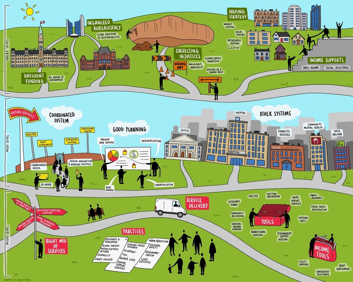
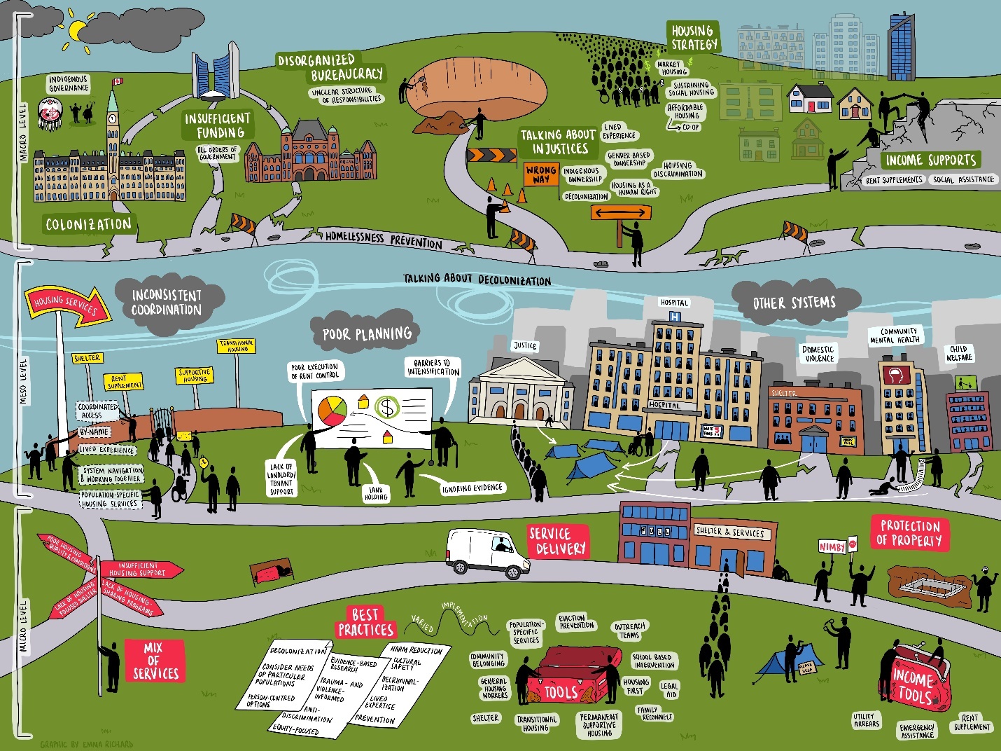
Several project team members had previously worked with a graphic recorder who joined us for study team meetings or knowledge mobilization activities to illustrate the discussion throughout the day. These recordings served as a form of ‘minuting’ but with added visualization that more effectively illustrated both key points and complexities of often very long meetings. Meeting minutes many dozen pages long would be much less accessible than these visualizations. The project team wondered about sharing the full volume of the findings to date, compiling the written list of all the factors as well as talking through our findings with the graphic recorder to see what she might illustrate and if this would lead to a more accessible framework. We brought in an illustrator and graphic recorder, Emma Richard, and shared the preliminary project findings. This led to a first visual draft of the work (Figure 1).
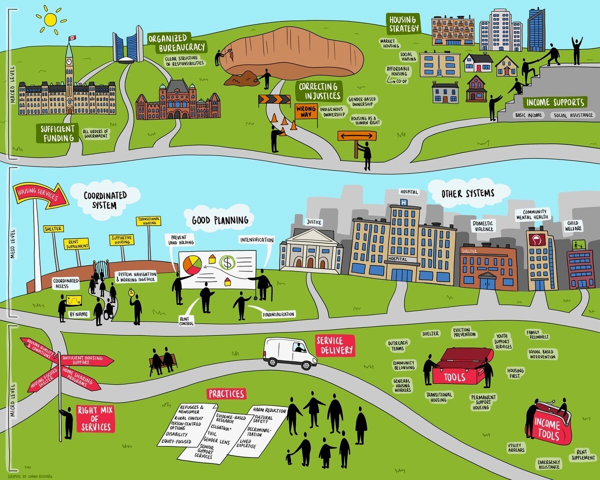
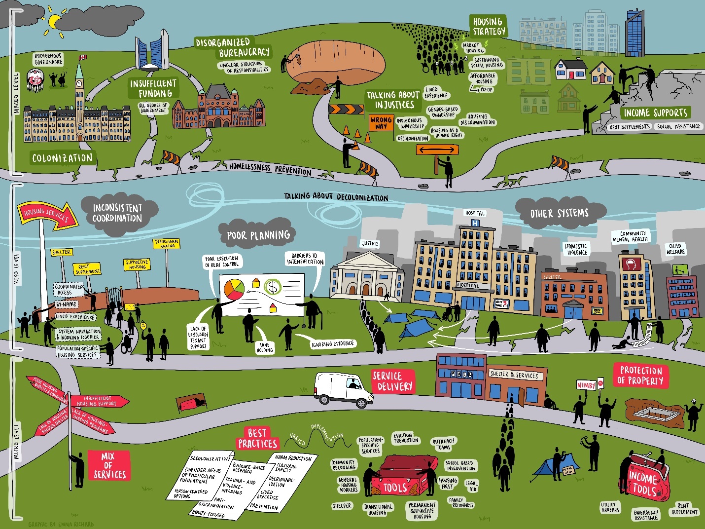
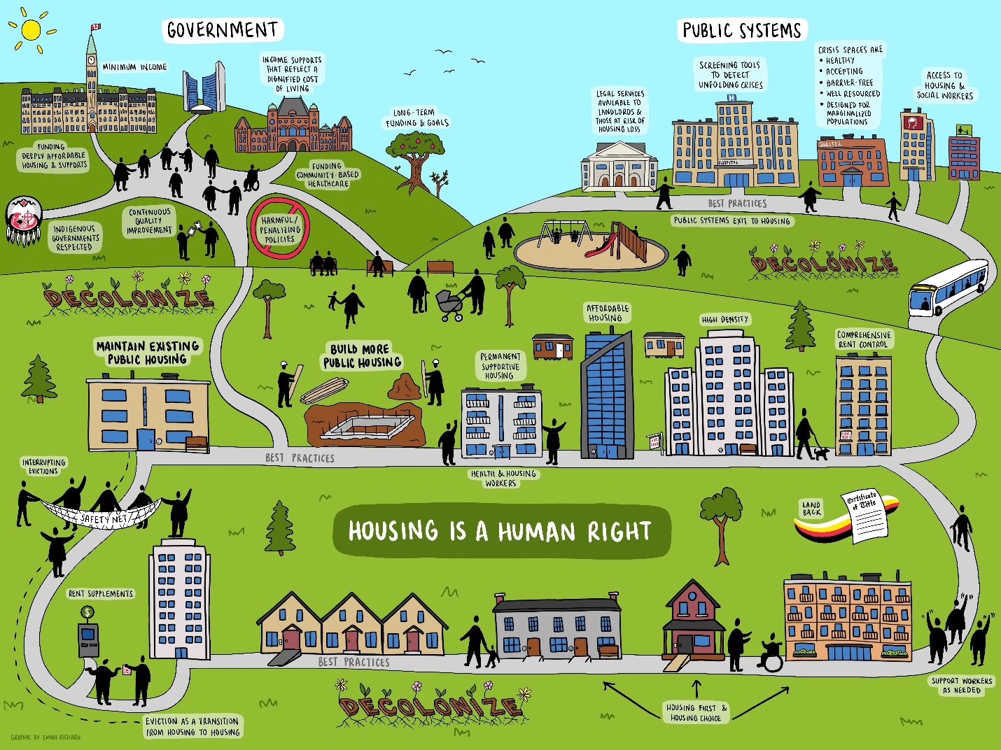
This preliminary illustration proved highly effective in terms of building a very large volume of data into a single image. It was first shared with the project leadership team and subsequently with the full research team. Each time, it generated significant conversation and reflection on both the impact of the image, but also on a series of revisions to ensure all concepts were captured and to alter the position or terminology of several concepts. This led to subsequent conversations and versions generated by Emma, the illustrator. However, the most important issue identified, that was blocking our analysis, was that in one image we were attempting to capture both the challenges with current systems as well as envisioning an optimal, transformed system. It was by reviewing the visualization that we realized the analysis needed to be advanced by separating out ‘what is’ and ‘what could be’. We went back to Emma with the request for a ‘current system’ and a ‘transformed system’ version of the framework, which was produced. This created far greater coherence of the message present in the visual frameworks and allowed us to integrate all of the project data, including the concerns with current systems and the hopes for a better future system (Figure 2 & Figure 3).
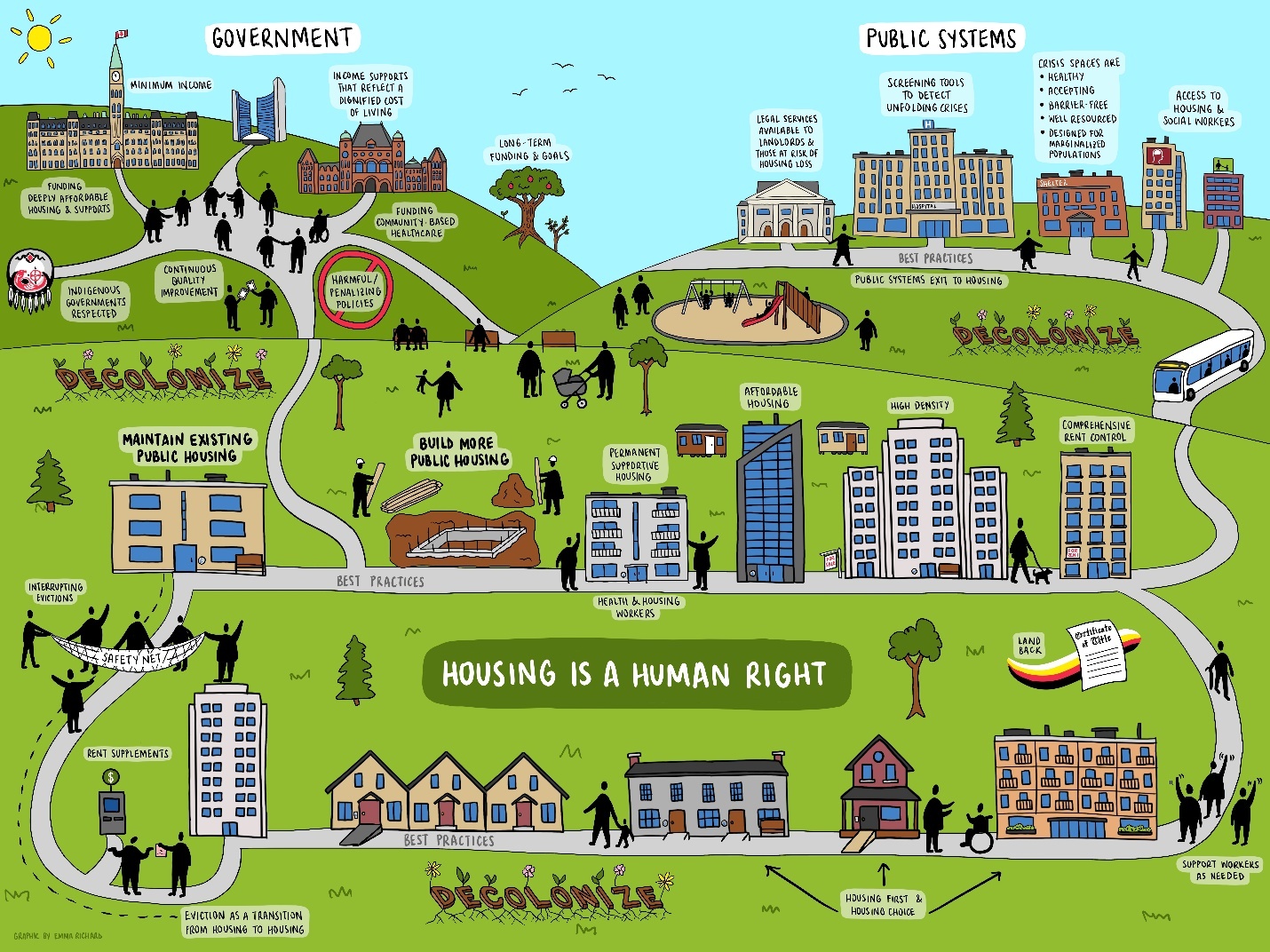
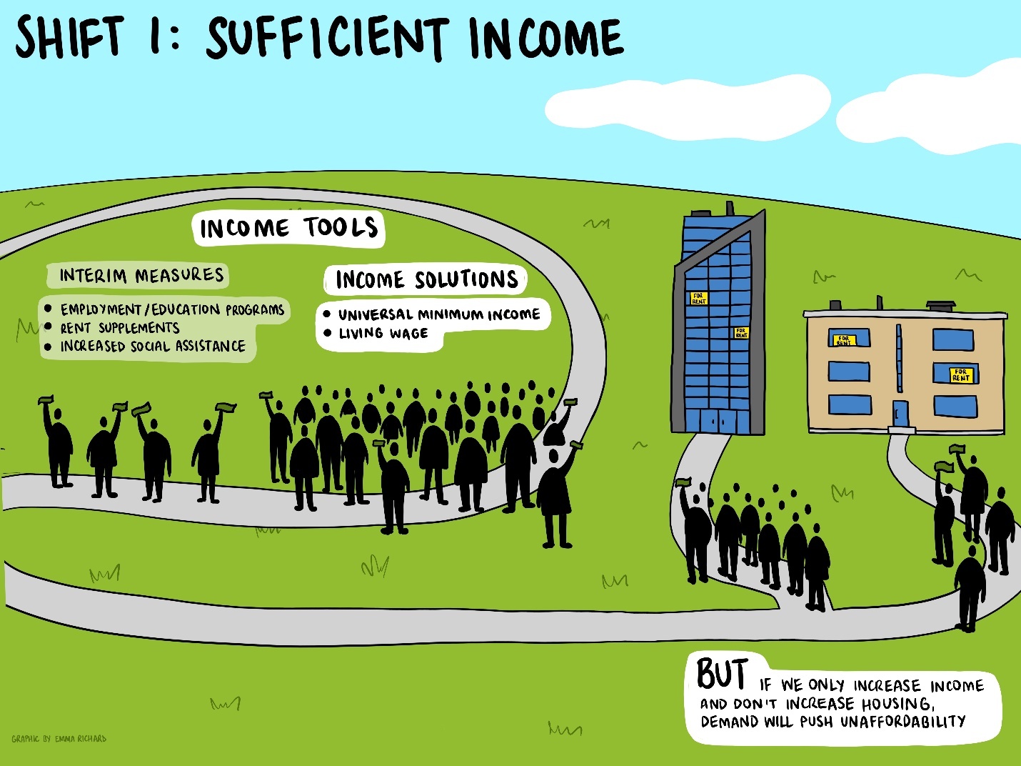
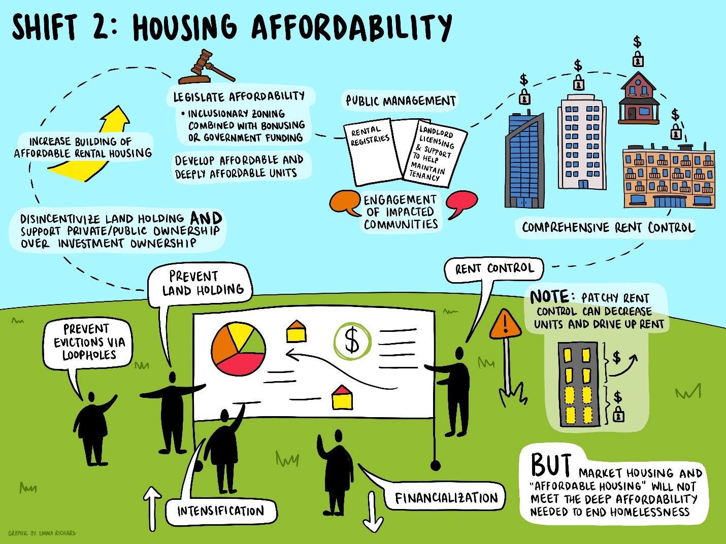
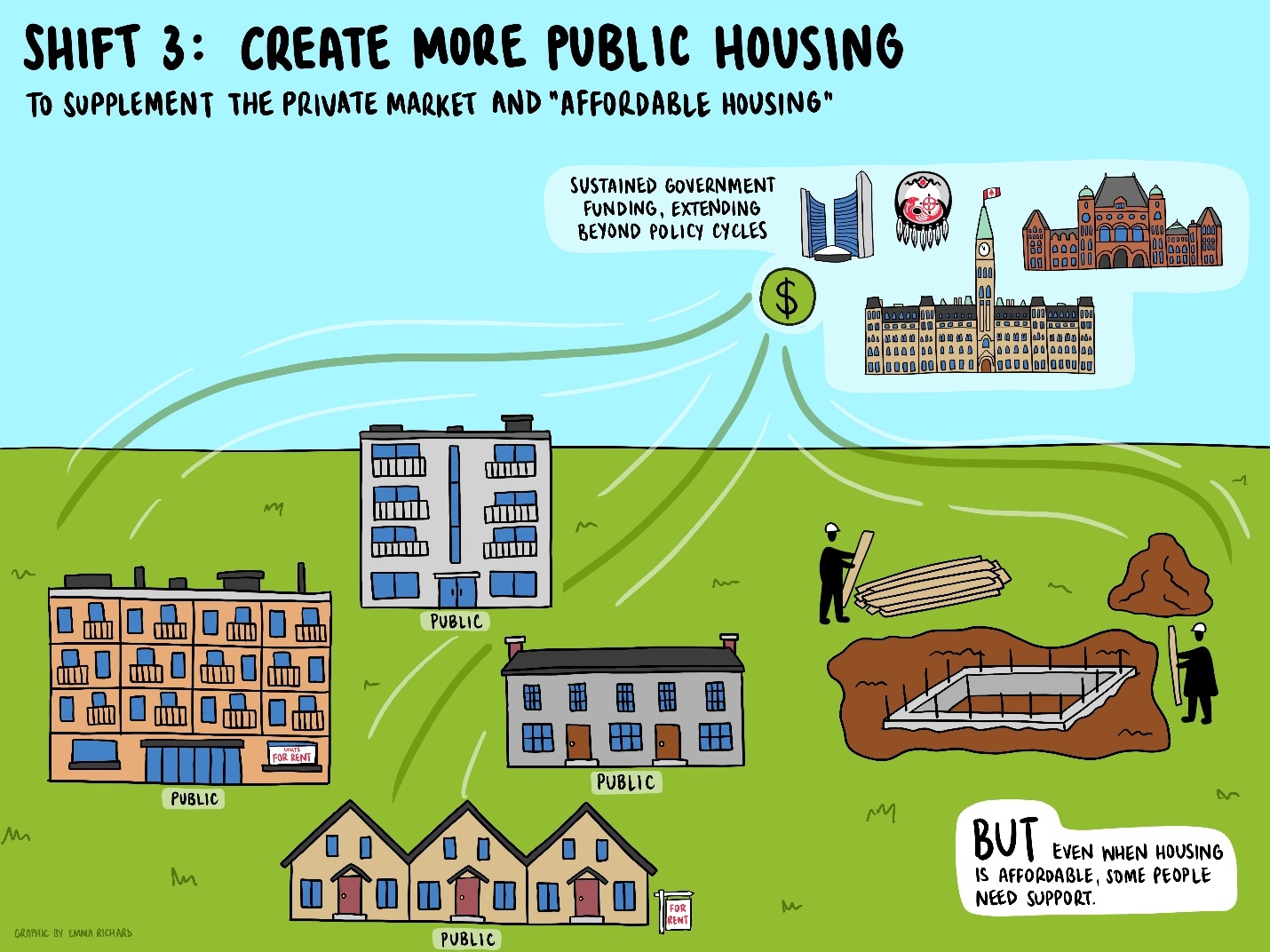
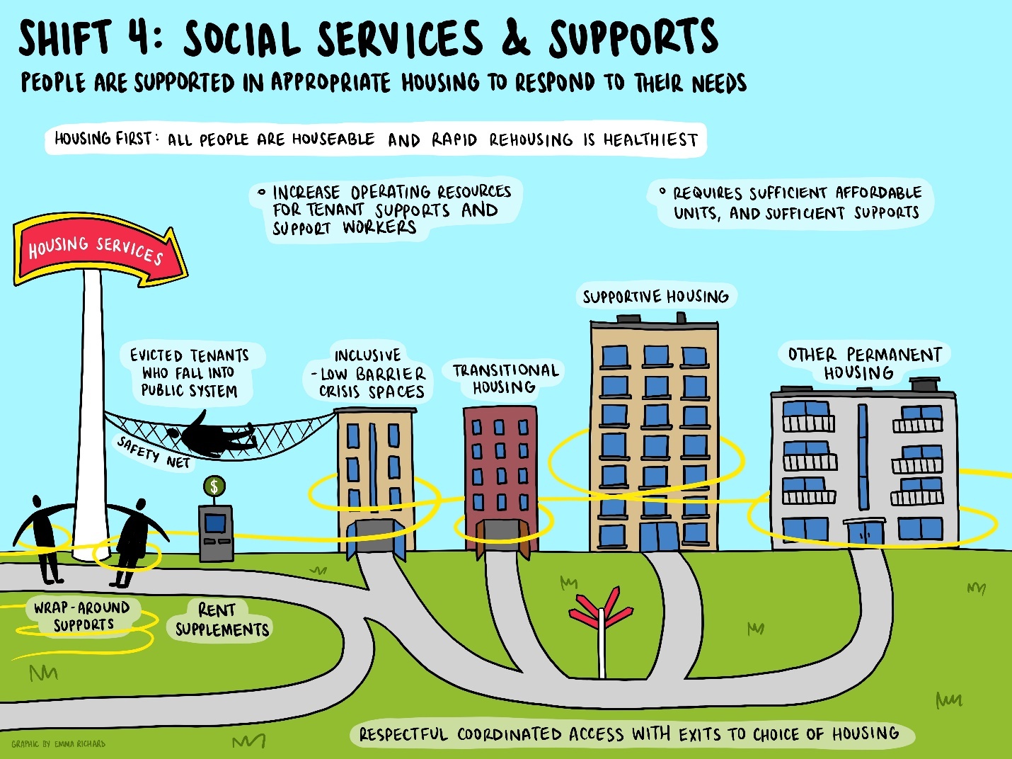
Preliminary presentation of these images then pushed us into the next necessary phase of the analysis, considering what it would take to get from the current image to the future one. Sharing the new framework images with the research team, as well as presenting them as preliminary findings at conferences locally and nationally, naturally created conversations around necessary policy transformations. This data was present in many of our key informants already, and was supplemented by the conversations with those who viewed the framework illustrations. These policy shifts/transformations became our next discussion with Emma, how to capture all these different changes. In listening to us talk through the transformations, Emma chose to subsequently illustrate each one, as we ultimately landed on four: Figure 4, 5, 6 & 7.
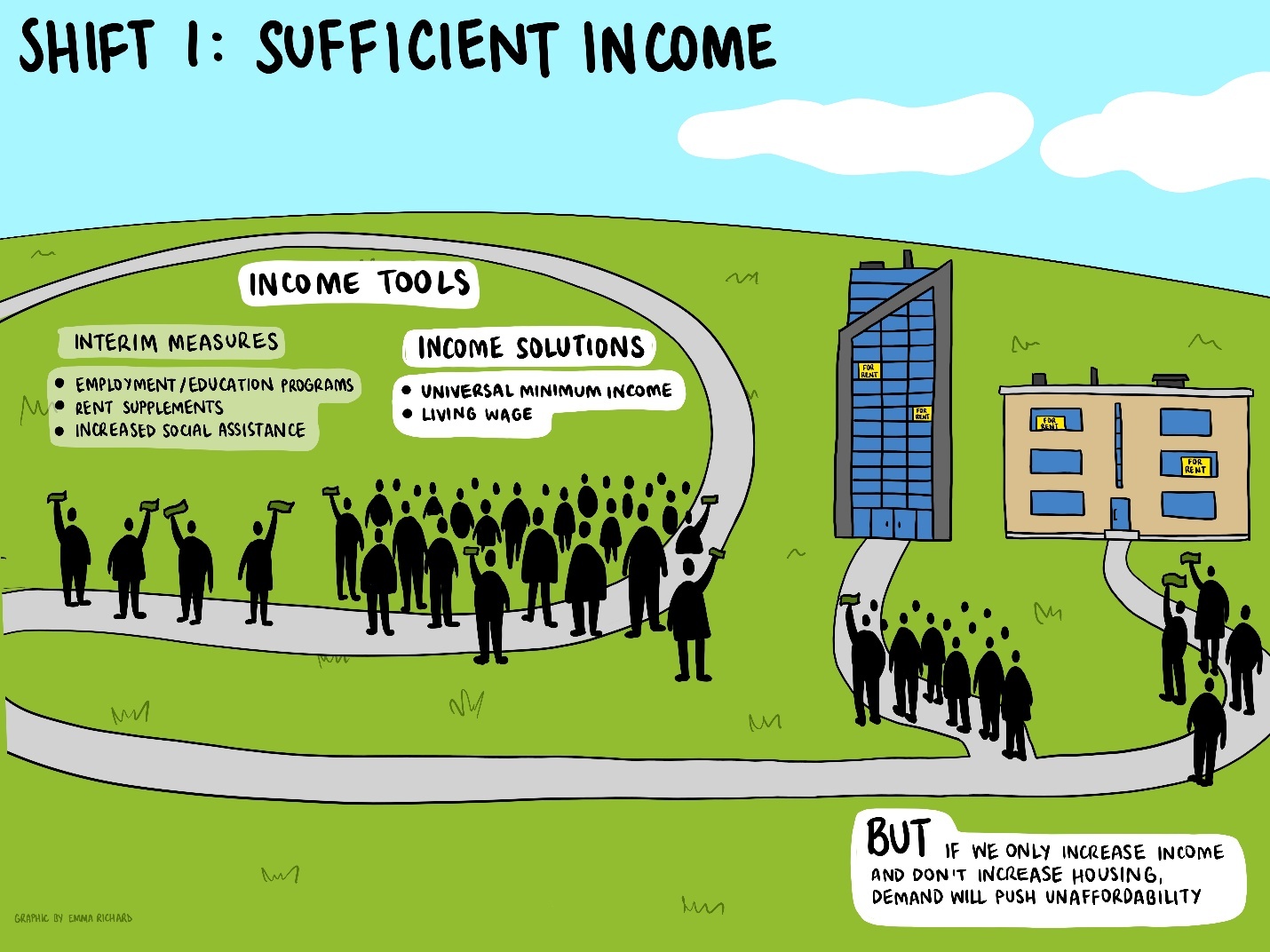
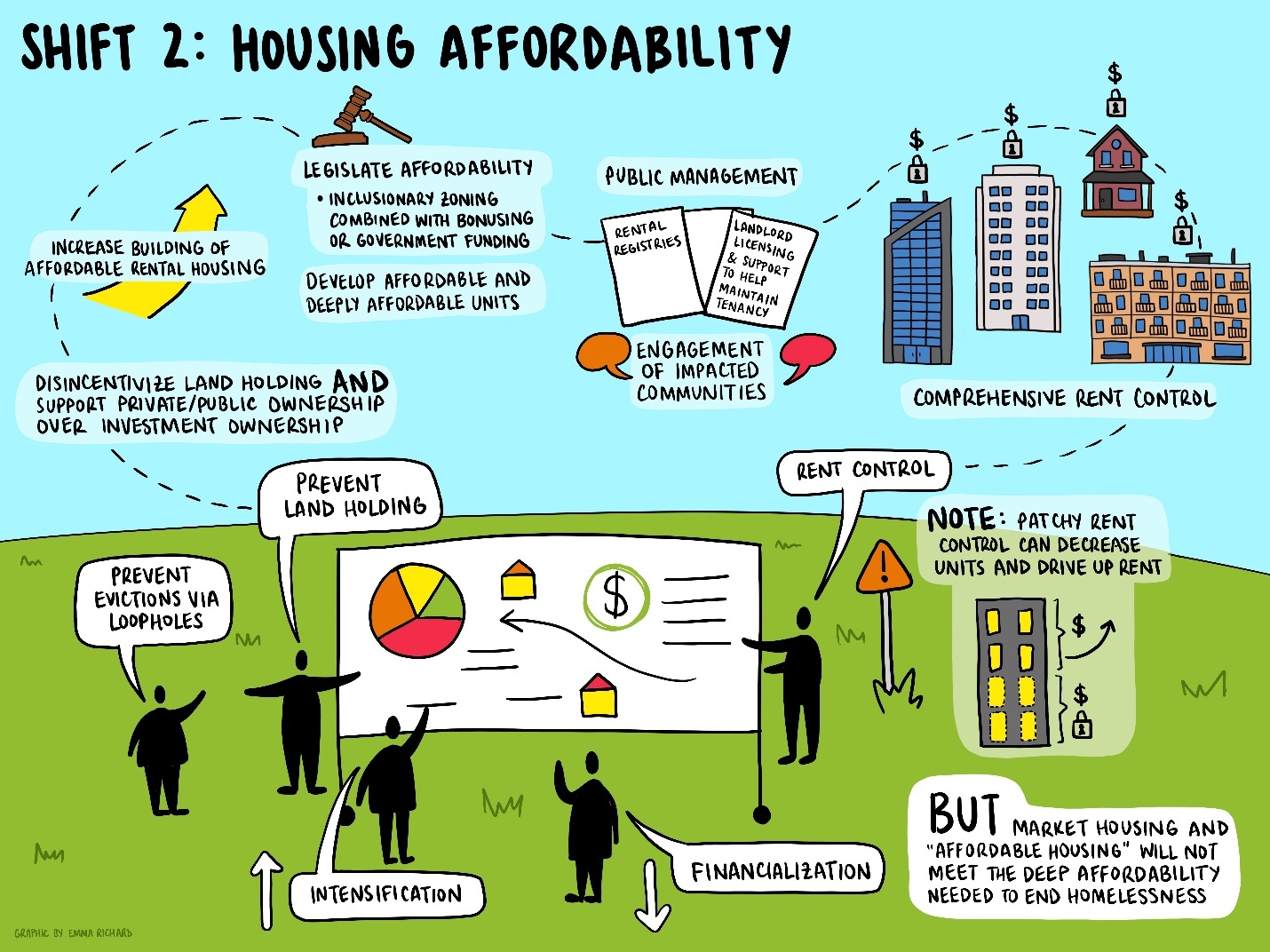
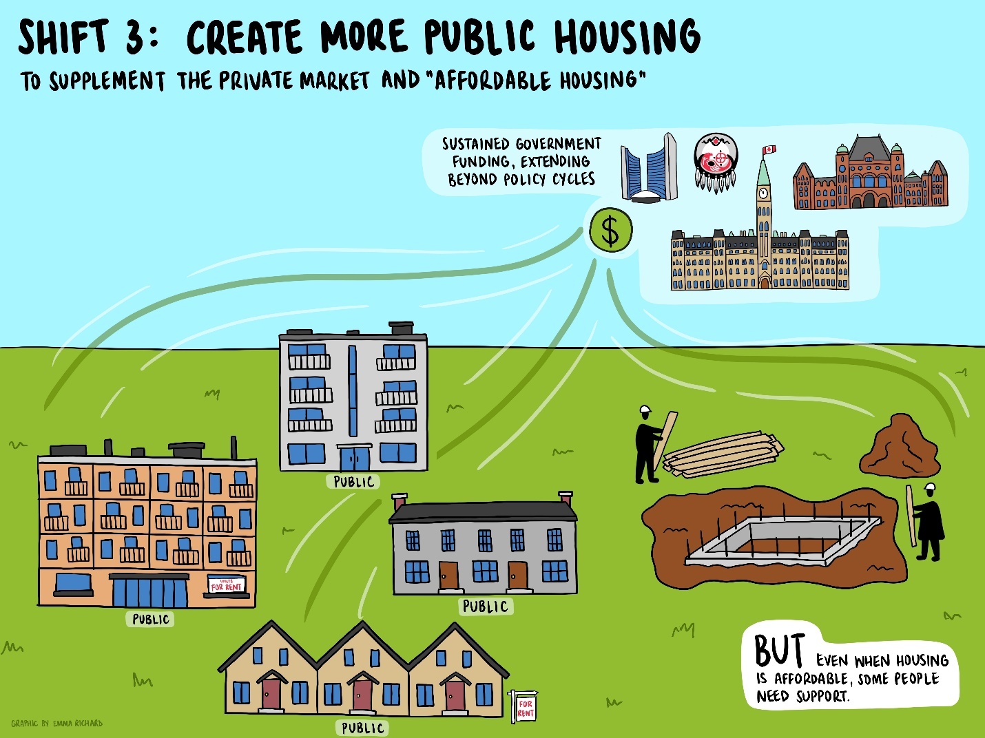
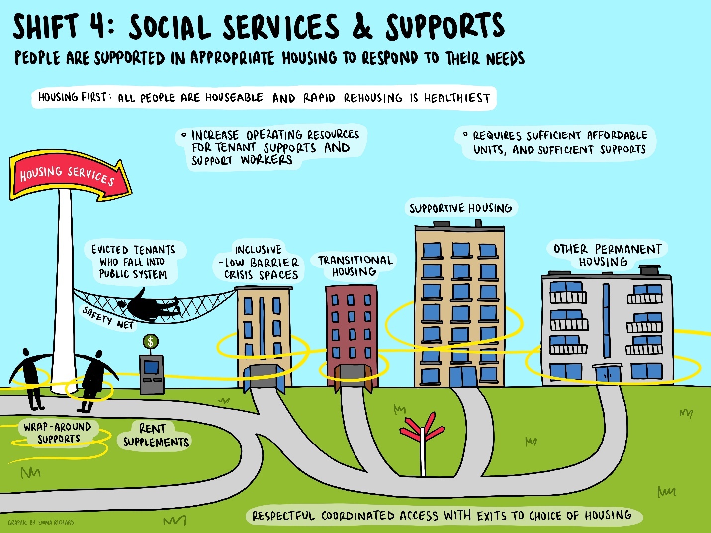
This total package of the current system, the ideal system, and the policy moves required to get there, became the visual package presented in phase 2 of this research. These illustrations and an associated presentation were shared with our focus groups of key informants ahead of time, and then presented in brief and discussed in the groups. Focus groups again were constituted of: 1) Academics; 2) People with lived or living experiences of homelessness; 3) Service providers; 4) Activists; and 5) Policy-makers or those implementing public policies. This included established networks or organizations such as municipal/regional homelessness coalitions/alliances, service provider organizations, or housing/homelessness conference attendees. The visualizations again facilitated the presentation of a massive volume of preliminary data in an accessible format and allowed for sufficiently comprehensive discussion of an otherwise complex question (solving homelessness) in the 60 or 90 minutes available for focus groups. The engagement and discussion were exceptional. Each of the groups identified areas for refinement or revision within the frameworks and policy transformations. These were shared back to Emma who continued to refine and update the images from this feedback. This has ultimately led to final versions that are ready for dissemination and publication.
Methodological Implications
There is no singular methodology of critical policy analysis (Apple, 2019). Rather, policy analysis is a common usage terminology that some scholars have structured in a variety of ways into a methodology. This includes ‘policy analysis’ and ‘critical policy analysis’ approaches that cross a variety of paradigmatic perspectives and use diverse methods. For our team, engagement of a graphic recorder and use of graphic illustration to structure both our analysis and our findings was not predetermined but came as a suggestion from our project team, a benefit of having a large, participatory team engaged in the work. This choice advanced us twice through two analytical ‘dead-ends’, being stuck in considering both current and desired policy structures, and not knowing how to capture necessary policy transformations. Considering the current state of research on visual methods, this study provides a practical example of how graphic illustration can operate as an analytic driver rather than an endpoint in qualitative research. It was through our back-and-forth process with the research team, research participants, and the graphic recorder that were able to become ‘unstuck’ in our analysis. Secondly, the illustrations themselves gave us the opportunity to transform a huge amount of data into an easily accessible format for continued analysis. Seventy in-depth interviews generated hundreds of pages of transcripts, and document analysis similarly covered thousands of pages of existing content. Without creating visualizations, there is no way we would have the time required to simply share our preliminary findings with participants, let alone advance the analysis.
These points are important because images/figures are often considered a key output of research analysis, being used for knowledge mobilization. However, what we offer herein is the value of illustration as an integrated part of the data analysis. By doing so, we hope to advance the emerging methodological conversation on formalizing visual data analysis (Sturdee, 2025) and situate this method within a PAR methodology. This approach also fit with our values around PAR as this made the data accessible for our team members, not just academic team members who might be most used to heavy textual analysis. By having research team members made up of the same interested groups as project participants, finding our path to analysis and understanding through illustration within the project team also allowed us to find the way to present the data to participants in the second phase, the focus groups. It allowed for a story to emerge from the data. Therefore, the ability to meet the objectives and scale of the project hung on the method that evolved related to using illustrations. Notably, we believe this also improved the quality of participation and therefore feedback. As the illustrations were engaging and easier to comprehend, it allowed for focus groups to more thoroughly comment on the drafts and thus shape the findings and final framework.
Reflections from the Illustrator
In the spirit of participatory research, it is important for the graphic recorder/illustrator to share her experience of this method. Emma has provided the following reflections:
Much of my engagement with graphic recording or illustration in research has been as a form of knowledge mobilization, and something of an afterthought once the research has been completed. In this project, however, we used visual art as a way to make sense of the early data, transform it into a graphical framework, and engage participants in an iterative feedback process to refine the framework and imagine new possibilities. In this sense, the illustration process mirrored the social art of scribing, or graphic recording, with the interaction between artist and participants extended over the course of many months, as opposed to happening in real time.
As a graphic recorder, I consider myself a listener and sensemaker first, and an artist second. My work centres on taking in information, balancing the acts of summarizing and synthesizing it, and then communicating it in a visual way. It is working with the emergent. In the case of this project, that meant translating the data into individual images that not only contained a digestible amount of information, but that also told a cohesive story as a whole. It was through this process that the research team and I were able to notice that it was not just one image, but a series of images that were emerging from the data.
The creation of these images ultimately resulted in a shared language with which to see, name, and critique complex systems, their interactions, and their impacts. It allowed for the collective imagining of a transformed system that actually prevents and ends homelessness. In terms of knowledge mobilization, the seven images themselves tell a story, which can be further animated through the discussions that take place among the people viewing them. This approach has highlighted for me how art can be deeply valuable in research, not only as a product, but as a process too.
Future Methodological Considerations
Herein we have highlighted several of the benefits of using graphic illustration as part of a PAR process. However, there were some challenges we faced that generate considerations for future projects that might enact a similar method. Firstly, the illustrator was a step (or at times two steps) removed from the actual data collection. Key informant interview findings and document review findings were collated as summaries and then shared with Emma. Similarly, focus group discussion feedback was recorded and summarized for Emma. In this way, she was always receiving second-hand versions of the data we were asking her to illustrate. This is a different process to a graphic recording of, for example, a meeting wherein the illustrator is hearing the information in real-time and capturing it. Conceivably, we could have had Emma read the full project transcripts and data, but this would have been a very intensive task for an analysis that was instead shared across a project team of thirty-five members. Or, if we had considered this approach in advance, Emma could have been integrated as a team member involved in data collection directly. Either of these approaches would have been more time consuming, however would have likely made it easier for Emma to capture the study content rather than hearing it second-hand. While this would have created additional costs for her time in data collection, it would have reduced some of the burden created by constantly making refinements on the images.
Additionally, more attention could be paid to the power that exists in the role of the illustrator. This is a key consideration if visual methods are going to become an increasingly utilized approach, as appears evident from existing reviews (Bratun et al., 2025). The way they construct the images greatly influences subsequent analysis steps and therefore their vision of the design for the images becomes central to subsequent iterations. Because of this, it would have been optimal to include Emma as a formal member of the research team from the outset. If not involved directly in data collection, at least in this way she could have been fully apprised of the study and how it was unfolding. In a participatory manner, she could also have offered valuable methodological feedback in considering how her illustration could be used in different phases of the project, other than simply requests made to her from the research team. While not pre-determined in this case, what could also have been done is bringing her into the team once it became clear that illustration would be central to evolving the analysis.
Conclusion
Overall, using graphic illustration to evolve complex research findings (Dean-Coffey, 2013) proved highly beneficial in this study and is recommended as an approach. This is particularly true in doing complex critical policy analysis, however does not necessarily need to be restricted to this domain of research. It was clear to us that any multi-stage project, wherein findings from preliminary stages influence subsequent steps, can benefit from different means of organizing knowledge, and visual means are one of these. Within participatory research, it is vital that teams consider ways to make projects maximally engaging and accessible. Illustration in this study proved to be an exceptionally engaging format and sustained active participation in a study that unfolded over 5 years, including through the COVID-19 pandemic. Whereas some of our projects saw disengagement over this period of time, we received continual requests from participants to stay engaged with the work, such as ensuring they or their network were to be included in the focus group phases. Similarly, we have had very high engagement in presenting our findings at conferences with the illustrations now serving a vital role in knowledge mobilization. While the illustrations have also served as a very useful knowledge mobilization tool, our recommendation herein is that this method be considered as part of the analysis process itself, having proven instrumental in our work.