

The United States has a long history of race-based social and economic inequity, particularly in the American South.[1] Historical events and policy, including the Civil War, Reconstruction, and the Civil Rights Movement, produced some progress toward a more equitable society in the region. However, the COVID-19 pandemic, along with protests against police brutality and extreme economic distress occurring during the COVID-19 pandemic have revealed the persistence and depth of systemic social and economic inequity. Therefore, region-specific information is needed to understand how these challenges uniquely manifest in key policy areas such as education, employment, health, and wealth. Additionally, more information is needed to identify and understand the region’s unique and complex challenges, community strengths and challenges, and systemic barriers and failures.
To fully understand the region-specific history and consequences of social and economic inequity, it is important to consider the lived experience of those in the region. Incorporating the voice of the community can result in different ways of understanding the historic and contemporary challenges and consequences of key issues affecting communities in the South. While this information can come from conventional sources like surveys and institutional documents, personal narrative can also serve as a valid and relevant form of data. They reflect community perspectives and provide important context to deeply understand the complex realities of the region and inform decision-making, particularly for policy makers, and can inspire community action to address persistent key issues. Thus, more community-engaged research is needed to fully understand the community and create systemic change to improve social and economic outcomes for those in the region.
A community data walk is a community engagement mechanism used to share data and information and to elicit community voice, perspective, and feedback rooted in their lived experience (Murray et al., 2015). Data walks provide an interactive mechanism for sharing data on key issues affecting the community. Through critical interrogation and discussion, data walk participants develop deeper understanding of the issues, and can shed light on historical and contemporary context that explains the data and the issues they represent. Participants can also contribute to the development of community-centered and relevant solutions to address these issues. In this way, data walks represent one potential tool for participatory action research (PAR) (Ortiz et al., 2020).
This paper focuses on understanding the process, potential product, and value of using data walks as a participatory research method to elicit community perspectives and context on key issues affecting communities in the American South. We begin with a brief review of the literature on community engaged research (CEnR) and PAR, then introduce and describe the data walk as a method of PAR. We then explore the development and implementation of a data walk used in three aligned instances as part of a series of community events across three cities in the South. We describe the various phases of the data walk process from identifying the target participants, selecting and including the appropriate data to present, facilitating engagement with the data among participants, and collecting and analyzing the interpretations of, responses to, and reflections on the data. We share findings from across the community events and conclude with an explanation of key lessons learned and recommendations for others seeking to implement data walks.
Data walks as participatory action research
In recent years, research across sectors has included a focus on CEnR, which refers to “the collaborative process of working with groups of individuals who are connected by geographical proximity, same interests, or comparable circumstances, in order to address challenges that impact their overall wellbeing” (Balls-Berry & Acosta-Perez, 2017, p. 84). CEnR was initially developed as a response to past mistreatment of historically marginalized groups by researchers, who did not take into account the community’s needs when conducting research (Ortiz et al., 2020). There are varied approaches to enacting CEnR, including PAR (Ortiz et al., 2020). PAR focuses on collaboration and equitable participation of community members and leaders (Bradbury & Reason, 2003) and has been conceived as a foundation for social transformation because it is committed to the empowerment and active, democratic participation of the participants (Demuth & Mey, 2015). PAR methods have been used in various sectors, such as education, healthcare, community development, environmental studies, social work, agriculture, and rural development.
At the core of the PAR approach is the principle of collaboration, where community members play an active role in all research processes including planning, data collection, analysis, and sharing of the results and findings. This anticipates that researchers’ theoretical and methodological expertise and non-academic participants’ real-world experiences mutually benefit each other (Delmas & Giles, 2023). An important component of PAR is that the research should be done with the people under study rather than being done for them (Demuth & Mey, 2015). PAR focuses on moving from knowledge to action; this moves from building a relationship with the community and shaping the knowledge and research question, to collaborative action and recommendations based on the findings. This highlights a primary objective of PAR as not just to produce knowledge, but also utilize that knowledge to bring about positive social change in a community. Methods used in PAR often include visual methods or spatial and temporal mapping to engage a variety of non-academic communities (De Vos et al., 2021).
A community data walk is one potential tool for PAR. Data walks combine the fundamental concepts of cooperation, participation, and action at the core of PAR, by providing “an interactive way for community members, including residents, researchers, program administrators, local government officials, and service providers, to engage in dialogue around research findings about their community” (Murray et al., 2015, p. 3). During a data walk, participants walk around and view physical data visualizations (such as a poster), then “interpret, discuss, and reflect” on the data from their own perspectives (p. 3). This can promote community engagement with research by providing individuals with the opportunity to actively engage with data and share how the data aligns with their lived experiences. This approach facilitates the development of citizens’ skills in data comprehension, helps residents in a community understand the research that is being done in their community, encourages communication across various community groups, and empowers community members to take action to implement policy change (Murray et al., 2015). Furthermore, discussion among data walk participants can also reveal what data is missing to fully understand and address community needs (The Annie E. Casey Foundation, 2016).
Selected publications provide direct examples of data walks used to advance community engagement with data and for participatory research and development aims. For instance, Fattah and colleagues (2024) have outlined the use of data walks in diversity and inclusion efforts within academic medicine to foster trust and transparency in academic institutions. Jarke (2019) has focused on using data walks to engage non-tech-savvy citizens in co-design. Yet, despite select descriptions of data walks as a methodology and conceptual alignment between data walks and PAR processes, there is relatively minimal literature on the process of implementing and conducting data walks based on direct examples of this work; this is particularly true when considering work that focuses on the data walk as the core topic of focus itself. This highlights an opportunity for scholars and practitioners to broaden their methodological toolbox and bridge the gap between research and policy change.
Use Case: State of the South convenings
MDC is an organization based in Durham, NC with a mission of advancing equity and economic progress in the American South. This mission is grounded in the history of race-based and economic inequity in the United States, and particularly in the South. MDC launched the State of the South convening series as a platform for exploring whether and how Southerners are reckoning with contemporary economic, social, and environmental challenges. The State of the South Project focuses on the 13 states that comprise the American South which include Alabama, Arkansas, Florida, Georgia, Kentucky, Louisiana, Mississippi, North Carolina, South Carolina, Tennessee, Texas, Virginia, and West Virginia.[2] In October 2022, the first convening was held in Durham, NC at North Carolina Central University, followed by a second convening in April 2023, held in Berea, KY at Berea College and a third convening in February 2024 held in Charleston, SC at various community organizations in the area. Convening locations were selected based on MDC relationships with community organization partners across geographies. Existing networks were used to identify locations with organizational partners who felt that convening efforts would offer value and who were interested in participating in, informing, and engaging the convenings; this was intended to ensure that convenings were developed with local collaboration and benefitted the area in which the convening was held. MDC personnel conducted outreach to local contacts to affirm fit per the criteria above. In addition, locations were selected based on intent for locations to take place in different states and with variation in rural and urban geographies. For each convening, MDC worked with local community partners to determine key policy areas and topics of interest, which would then be discussed during the convening. MDC typically started with an organization or partner that was known to them. MDC asked these site-specific partners to bring together other key community leaders or organization representatives for discovery conversations that addressed their vision for the South and primary barriers to realizing that vision. Themes emerging from these conversations provided a basis for site-specific topics for the data walk.
While all convenings addressed overarching topics relevant across communities such as poverty, income, and housing, each convening also included topics that were specifically curated and relevant to each location. For example, the Berea convening uniquely addressed disaster recovery, while Charleston focused on predatory lending. In this way, each convening was community centered, with local partners actively engaged in determining which policy issues were most relevant to their community. Convening activities included local artist performances centered on and reflecting key issues of the region; moderated panel discussions; workshops and discussion; and a data walk, the focus of this paper. Convening elements are summarized in Table 1.
MDC used a variety of marketing strategies to promote convenings. First, they advertised the convenings on their website, sent email blasts, and via social media, inviting policymakers, academics, nonprofit leaders, artists, and community residents to discuss historical and contemporary context, and policy and pathways to create equity in the South. MDC targeted some marketing efforts by leveraging relationships with community partner organizations and relevant subject matter experts for the topics covered during the convening. These efforts helped to promote the convening with leaders in formally designated roles, and more broadly within their networks to increase convening attendance and engagement. The goal was to engage both community leaders and community residents to discuss key policy issues, including a variety of perspectives and lived experiences. Ultimately, convening participants represented a variety of nonprofits, academic institutions, foundations, local businesses, economic development agencies, other government agencies/offices, arts organizations, artists working with Black, Latine, and/or low-income communities, and other community members, though specific counts by sector were not collected until the third convening (where non-profit representatives were the largest group). The full convenings ranged in size (Durham: 111 participants, primarily from the Central North Carolina Triangle area and elsewhere in North Carolina; Berea: 124 participants, primarily from Berea area or eastern Kentucky; Charleston: 150 participants, primarily from Charleston area and South Carolina), though not all participants attended the data walk portion of the convening, with an estimated 70-100 participants in Durham and Charleston and an estimated 40-60 participants in Berea.
The Data Walk
With the goal of developing participatory approaches to engagement with data, MDC partnered with the Duke University Social Science Research Institute (SSRI) to develop and implement data walks within the convenings. The data walk was a component of each each convening, and was intended to address the following questions: 1) How do individuals respond to quantitative data profiles about the key social issues in the South? In particular, how do they respond with a critical lens and based on lived experience? 2) Based on this response, what is needed for societal advancement or to provide a more comprehensive and holistic understanding of the world around us?
Data Profile and Visualization Development
Our process began with the development of quantitative data profiles that addressed these questions. The foci of these data profiles were driven largely by the local partner organizations, which communicated key issues of interest in their community; this was based on partner organization input rather than broader resident engagement due to challenges in broader residential outreach far in advance of the convening (e.g., logistical feasibility, questions of trust), which would have been required for shaping the data walk, and due to the view that these organizations could speak to the interests of their local community members and thus inform the focus of the data walk. For each convening, local partners expressed interest in key issues as shown in Table 1. Researchers searched for relevant data for each key issue and data profiles were developed based on the analysis of publicly available quantitative data. These profiles represented visual depictions of trends in states across the South, and where relevant, change over time. In certain cases, and where data were available, data was disaggregated by location (e.g., city, county, or region), and by demographic factors or resident characteristics such as race and ethnicity. These data profiles were generally based on publicly available information from the U.S. Census Bureau American Community Survey or other governmental sources, and often required analysis and merging of datasets to generate the desired focal data points to visualize the data (e.g., merging multiple years of racial demographic data for States to reflect change over time). Based on MDC strategy and local partner response, the geographic focus shifted across convenings toward increased centeredness on the community in which the convening occurred. In Durham, the data profiles focused generally on trends across the Southern region; in Berea, data profiles depicted trends in the Central Appalachia region; in Charleston, the data profiles focused largely on the Charleston and North Charleston areas and surrounding counties.
After data profiles were determined, data visualizations were created, presenting data that reflected the key issues for each convening, shown in Table 1. Visualizations were initially created in Microsoft Excel, then refined using Data Wrapper and Flourish, which are free, online data visualization tools that provide more visually appealing options for presentation. Researchers used the generally accepted principles of data visualization to ensure visualizations were clear and accessible for a range of audiences. Visualizations were printed onto posters at a local print shop, then attached to boards for display. The final number of visualizations varied by location, ranging from 16-21 visualizations for each convening.
For each convening, the final set of visualizations presented was determined based on an iterative and collaborative process involving regular meetings between the researchers and MDC, which was in constant communication with local partners. This process reflected a bottom-up approach, grounded in the needs, issues, and context of the community.
Implementation
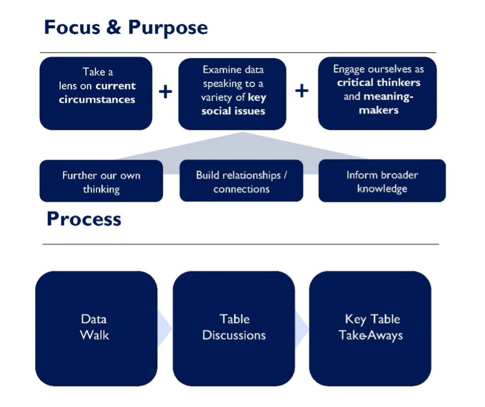
The data visualizations were presented to participants on posters in a data walk during the convenings held in Durham, NC in October 2022; Berea, KY in April 2023; and Charleston, SC in Feb. 2024. To begin the data walk process, the research team presented the purpose of the data walk to participants, with a focus on encouraging them to engage critically and reflectively with the information shown. The research team also informed the participants of the contextual limitations of the data, specifically noting that the data shown in visualizations reflected socially constructed categories and boundaries (e.g., political geography, racial categories) of publicly available data and emphasized that the visualizations were a snapshot rather than comprehensive depiction of local and regional issues. See Appendix A for a presentation of the data walk process and instructions shared with participants at the start of the data walk, and Figure 1 for an overview of the data walk focus, purpose, and process.

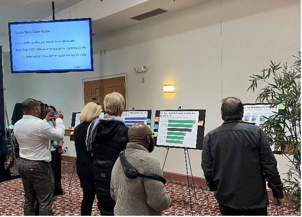
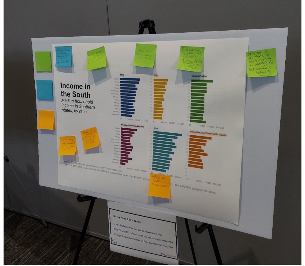
Data visualizations had been placed on posters on easels around a room in advance of the session. After the initial explanation of the process, participants were asked to walk around the room and look at and critically examine each visualization on their own, without interacting or discussing with other participants. Participants were then asked to interpret the visualizations via individual reflection and indicate where data shown a) resonated with or reflected their lived experience, and why; b) did not resonate with or reflect their lived experience, and why; and c) where it surprised them. Different color sticky noteswere used to indicate the type of response (green sticky notes = reflects experience; blue sticky notes = does not reflect experience; and orange sticky notes = surprises). Participants were given approximately 20 minutes to walk around the room, write their reflections and comments on sticky notes, and place them directly on the visualizations. This was considered the “data visualization response” phase. Participants were not required to view and reflect on with all visualizations shown, and they were not told where to begin; they could focus more time on visualizations that were of more direct interest or relevance to them if desired. This was due to was the time limitations of the broader convening schedule, the desire to provide information on an array of social issues, and the intent to foster participant self-direction. Figure 2 shows convening participants engaging in individual reflection and Figure 3 shows an example of how color-coded sticky notes were used to capture participant comments.
In a second phase, participants gathered in small groups to discuss and share their individual reflections. During this phase, they also discussed other broader questions, including how history may have affected present realities;[3] societal or policy changes participants would expect or desire; and participants’ critical thoughts or questions about the construction and use of data itself. After the small group discussion, participants were asked to individually reflect on and share three key takeaways from their discussion via an online survey platform form. Respondents were instructed to address anything they felt was salient for themselves or their small group and provide examples of topics addressing questions or consideration about the data themselves, how data were understood, or steps that may be taken. This was considered “key takeaway response.”
In a third phase implemented only in the Charleston convening, a convening moderator then asked the larger group to share their thoughts on the data walk experience and how it could be translated to action to address community issues. Participants provided their responses verbally as researchers recorded their responses by taking notes. This was considered “large group discussion response”.
Community Response
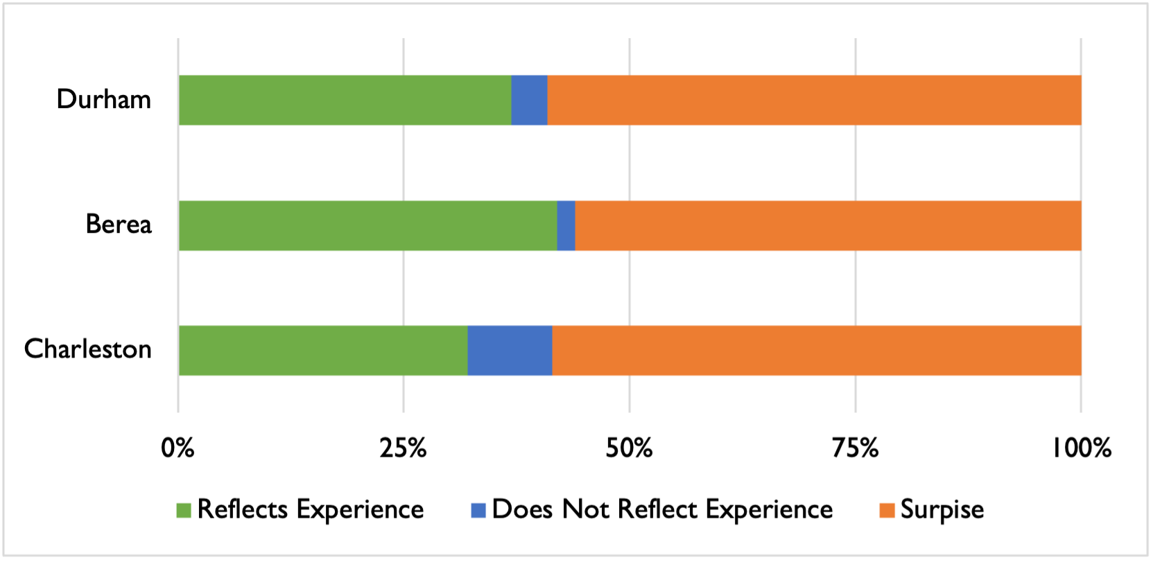
In total, this process resulted in 277 direct data visualization responses, 233 final key takeaway responses, and 13 large group discussion responses, all speaking to critical perspectives shared by participants, shown in Table 2. We examined and analyzed participants’ responses, the data walk data visualization responses, key takeaway responses, and large group discussion responses, as qualitative data. We developed a coding schema to reflect community issues and themes addressed during the convening, and we utilized qualitative coding software (NVivo) to apply this schema directly to our qualitative data. We initially examined each set of the data separately to determine the specific focus and content of community interpretation and responses. We then examined the data all together, with specific attention to dominant themes that emerged.
Each convening covered different community issues and the data walk elicited key insights from participants. Durham, NC participant data visualization responses primarily reflected on wealth and income, housing, and political engagement in the data visualization responses. In key takeaways, respondents often mentioned wealth and income in combination with housing: “Essentially an individual’s entire check is going towards rent /mortgage based on the poverty and income data. Has to be demoralizing for a person who is trying to make it.” The data visualization responses also showed a focus on surprises or questions rather than reflecting on whether the data reflected the participant’s lived experience. The primary question that emerged was “why is this [issue] the way it is?” with a specific interest in understanding differences between states, particularly since data visualizations often depicted comparisons of trends across states across the South. Key takeaway responses more often noted gaps and needs in data itself, often focusing on a call for availability of more comprehensive or nuanced data. For example, one respondent said, “Data seems so ‘correct’ and ‘permanent’ and unquestionable. This is how it is. But for almost every slide/data set, there is important context that is not captured.”
In Berea, KY, data visualization responses from participants focused primarily on incarceration, childcare, and disaster recovery; these were specific topics developed for this convening and were not of focus at the Durham, NC convening. Unlike the other convenings, visualizations related to housing and income elicited the least number of responses when compared to the other topics. This convening was similar to Durham in that both types of responses focused on surprise and questions rather than on policy recommendations. Most of the responses reflecting surprise also included questions. For example, a response to the Disaster-Related Damage visualization reflected a surprise that also asks the question, “Over what length of time? Did all people complete the Household Pulse Survey [data source for this visual]?” Most questions related to desire for a deeper or more nuanced understanding of the data. Berea key takeaway responses, more so than other convening sites, focused on the limitations of the data presented in the visualizations. Many of these responses highlighted a desire for more information than the data could provide as well as questioning the limited perspective offered in a quantitative data snapshot. For example, participants responded, “How many [incarcerations are] related to drugs? How many people of color?” and “These graphs are a snapshot of data, not a full picture of trends over time.” Berea participants also highlighted limitations with the data walk process itself, including a desire for information about the data selection process and expressing difficulty with processing the data in the amount of time given. One key takeaway response noted, “Data loses credibility when methods are not accessible at the same time they are being considered.” A recurring request was for more time to process the visualizations, such as “Interpreting data and synthesizing ideas and finding patterns takes time, not a 10-minute data walk.”
In Charleston, SC, like in Durham, NC, responses overwhelmingly focused on inequities in housing and wealth and income. Of note, housing was a particular focus of the visualizations at this convening, as were changes over time in housing (e.g. cost) over the recent past. Direct visualization responses reflected surprise or questions about the data shown, suggesting that they represented new information for participants. Many of these questions reflected questions about how different equity factors interact with each other. For example, a response to housing visualizations asked, “How does homeownership impact the racial wealth gap?” Some visualization responses provided context for the data, including brief explanations for myriad causes or factors that contribute to what is reflected in the data. Other responses reflected a variety of questions including wondering about the consequences of and actions needed to address what is shown, as well as questions about the omissions and limitations of the data (e.g., the lack of data availability for some demographic groups).

Across convenings, key takeaway responses often expanded upon the prior data visualization responses. Key takeaway responses frequently posed critical questions about data themselves; this was likely based on facilitation, as small group discussion and key takeaway prompts and instructions included encouragement to critically considering what data are available and how data are used. Key takeaway data also more often addressed recommendations or policy directions than did data visualization responses, again potentially based on prompts provided for small group discussions; yet, key takeaways addressing recommendations or policy direction were limited relative to other response foci, and especially question interrogating data themselves. By convening, key takeaways addressing action steps were more common in Charleston.
Finally, shortly after the conclusion of each convening, MDC distributed post-convening surveys to participants via email. The survey asked for participants’ feedback on individual events and components of the convening, including the data walk. Some participants’ feedback from the survey was similar to comments from the data walk. For example, survey responses from the Durham and Charleston convenings spoke to the benefits and usefulness of the data walk for “getting folks talking to each other, learning and sharing insight, offering opinions and inquiry” and “highlighting issues that need to be addressed in that they are a direct correlation to the outcomes currently experienced by disadvantaged communities.” Survey responses from Durham and Berea spoke about the need for more time to interact with and discuss the data. A response from the Berea survey also reflected lack of familiarity and understanding data walks in general, expressing issues with understanding the value of the data. Other responses from the Berea survey spoke to challenges with the data shown in terms of scope and accuracy.
After each convening, researchers developed a memo to share the results with MDC. Each memo highlighted key findings from the convening, with some comparison of differences in findings across convenings where appropriate.
Discussion
Our process and results provide evidence of multiple values for a community engaged research settings and data walk processes. First, our results support value of data walks in encouraging community education and engagement on key topics of focus. Through individual, small group, and large group reflections, data walks facilitated knowledge-building and critical thinking regarding the specific topics covered, including the issues addressed, the historical and contemporary contexts and relevance, and implications for their communities. Numerous participants requested the data visualizations shown, and select community leader attendees specifically noted that this information will help them in their current community-based work. Second, the data walks also facilitated a critical perspective of issues related to the data itself, such as the limitations of existing data sources and complexity in utilizing existing large-scale quantitative data. For example, participants demonstrated interest in the implications of missing data for certain racial and ethnic groups or the context that a focus on quantitative data in a single visualization does not capture. This indicates the potential value of data walks for community collaboration on assessing available data, data needs, and presentation of data, which could serve as a mechanism to engage community even in the early stages of a variety of projects. Third, a small number of participants inquired about the data walk process itself and considered how they may use a data walk in their own community work. This indicates capacity-building not only by sharing the specific content information, but also by expanding participants’ potential tools and knowledge in PAR practices. Fourth, we identify the value of a data walk for expanding researchers’ views. For example, our data walk reflection prompts and discussion questions were intentionally designed to be broad and encourage a range of thoughts and responses. Yet, we did not anticipate the degree of questions and surprises in reflection, relative to potential action steps. This demonstrates the generative nature of open-ended engagement and the fact that what emerges may not align with what is anticipated, which occurs in research overall but perhaps more notedly in qualitative data collection. The identification of unexpected perspectives can enrich one’s data and identify new directions or priorities.
Our implementation of three distinct but aligned data walks also suggests potential effects of variation in data foci and formats. For instance, the varying geographic foci of data in each convening was a key difference across data walks and could explain differences in results. Where Durham convening focused more on data addressing the South overall (and less on the specific Durham area), we found fewer cases of respondents identifying with results shared or offering policy recommendations than in Charleston, which was highly focused on the local Charleston community. The Berea convening focused on the Central Appalachia region, and there were more questions about the data itself; this may have been related to the fact that Central Appalachia includes varied communities, including numerous states and a combination of rural areas, towns, and smaller cities. The process of the data walk as a component of the convening also changed across locations. In Durham and Berea, the data walk followed a history session but was a distinct component; however, in Charleston, the data walk was directly combined with a session on local history. The history session combined with the data walk may have allowed participants to make clearer connections between the changes in their community and the data trends; the focus on community change over time in the history session could have driven participants to consider how their past, present, and future interact, hence leading them to consider policy recommendations to remedy the issues presented in the data for future generations. In addition, in Charleston, the large-group discussion was added as a closing component. This could have also supported more focus on policy directions in key takeaways relative to other data walk locations; and may have facilitated the shift from critical reflection to next steps. The differences in convening results demonstrates the importance of carefully considering choices in data walk implementation. Even seemingly minor changes, such as combining it with a related session, could influence how participants interact with and respond to the data, thereby significantly affecting the results.
Our processes also addressed substantive convening goals of fostering participants’ understanding of social issues and inspiring, informing, and facilitating potential policy change. Many responses in poster notes and key take-aways addressed new knowledge on historical and contemporary contexts (e.g., evidenced by the “surprised” poster responses); responses often also identified questions or critical wonderings about social issues in the past and present, reflecting goals of critical thinking about social issues. We saw evidence of suggested policy recommendations, change, or action from participants. However, these were often broad rather than specific in scope (e.g., “We need more affordable housing!”). Although suggestions for policy recommendations were notably less frequent than were indications of surprise or reflections of personal experience, some participants commented on the need for action or posed questions that may indirectly impact community outcomes. For example, in Berea, no policy recommendations were suggested but one participant commented “How do maternal leave policies intersect with childcare costs, employment? If we improve how we care for caregivers and people who have babies, other data points will improve.” Similarly, in Charleston, a participant commented on the importance of voting, particularly for BIPOC (Black, Indigenous, and People of Color) communities that can be impacted by policy, suggesting the need for engagement to address key community issues.
Lessons learned and recommendations
Based on our process, we provide a set of key lessons that others can consider when developing and implementing data walks. Below, we share specific recommendations.
Data Foci
-
Determining what data foci are used in visualizations is critical, and significant thought and intentionality should go toward these determinations. The “what” (what data to visualize) is important as it reflects the topics of discussion based on relevance for the community. There may also be many different potential options for which data is selected to reflect key social issues. In our case, this included a wide array of options in social issues, highlighting differences in data points by varied characteristics such as race and ethnicity, and highlighting differences across varied localities (e.g., comparing trends in cities and states with national trends). One should also consider who informs this focus, including how specific community members can inform the data foci.
-
Be aware that the data you (or your partners) desire may not be available, and consider the implications of unavailable data. This includes lack of available data on specific topics (e.g., in our case, transportation access in specific localities, and also data overtly addressing community or cultural assets), lack of data on specific groups (e.g., where a subgroup is small enough that the original data source does not provide information, or where the group is not reflected in the way data are collected), or lack of data on specific geographical bounds of interest (e.g., physical areas that do not align with political boundaries). This is specifically relevant for data walks that are utilizing secondary data, such as government-collected data (e.g., data from the U.S. Census Bureau American Community Survey (ACS)).
-
Consider the skills and tools needed to manipulate, format, or analyze the data you desire. If using secondary data, consider the potential need to manipulate, format, or analyze the data so that it is useful for the data walk (e.g., combining data to reflect change over time or reformatting data to allow for comparisons across geographies). This requires some skill and attention to preserve the integrity of the data. Data manipulation and analysis can be achieved in tools like Microsoft Excel or R, which have different capabilities and learning curves.
Visualizations
-
Carefully consider data visualization principles, and at times make hard decisions, to ensure that your visualizations are clear and comprehensible. It is possible that data can be presented in any number of ways, some of which may make results clearer than others. An iterative process that includes many perspectives can help to clarify what is in fact most clear to the audience. In addition, visualizations may be complicated by an overwhelming number of comparisons. One should consider how to show varied comparisons if desired, or whether to limit or reduce the number of comparisons shown.
-
Consider varied data visualization tools. Data can be visualized in many software packages and applications, including but not limited to more commonly used tools like Microsoft Excel or Tableau, and no-cost visualization platforms like Flourish, and coding programs like R. These programs are all available for download or online and have varied costs, capabilities, and learning curves.
-
Ensure visualizations allow for open interpretation. A core tenet of data visualization includes ensuring the visualization is being crafted to present a clear driving take-away or meaning. However, in a data walk process, an aim is to allow for community interpretation, and the data visualizations and any titles or labels should foster community-centered interpretation and meaning. This process should enable the data walk participants to reflect, determine and share their perceptions of the key points and ultimate meaning of the data, rather than dictating meaning.
-
Determine possibilities and implications of grouping visualizations by topic or theme. If you are conducting a data walk in-person, the layout of visualizations in a room can affect participant experience and participant interpretation. If possible, consider strategically arranging or clustering visualizations, which can facilitate cross-connections between topics.
-
Incorporate different ways for participants to share their perspectives. In our processes, we used a combination of sticky notes directly on posters, group discussion, full group sharing, and individual key take-away sharing on paper and using a Qualtrics survey. Offering multiple ways for participants to engage can help reflect the varied modalities in which individuals learn and think and may positively impact engagement.
Making Meaning of Community Interpretation
-
Consider how you can and will record the interpretive perspectives being shared, especially considering logistical, team capacity, and administrative factors. While small-group discussion can be valuable in reflection, a team may not have capacity to have a note-taker at each table, and having a recording device may not seem appropriate or comfortable. In our case, as we did not have capacity for note-takers or recording devices at each table, we asked participants to share key points from their discussion in written key take-aways at the close. In addition, if the substance of reflection is considered data to be used for subsequent analysis, a team may need to consider ethics boards such as the Institutional Review Board (IRB) and needs for informed consent.
-
Determine how you will use the reflection items in analysis. Documented reflection can serve as data that can be analyzed to identify themes in community interpretation. However, specific information shared may not always be clear; a participant may provide a response that has implied rather than overt meaning. The team would need to determine and balance to what degree they feel it appropriate to make inferences on meaning where it is not clear, compared to the implications of discarding the data if their meaning is not overtly clear.
Community Partnership and Community Value
-
There is value and challenge when incorporating community partners in decisions about determining data foci and developing visualizations. Direct community engagement is helpful in determining and refining what is shown, and it means the specific choice of topics discussed will be community driven. However, this can increase the need for additional time in development and complexity in the process, as community partners may not have as much background knowledge about data availability as a research team. If possible, develop a timeline and implement regular meetings with partners to provide progress updates, communicate challenges and limitations of the data, and elicit input and feedback on the overall fit of the data and data walk process for the community.
-
Allow for your work to have a dual role as gathering insight and context from participants, but also informing participants by bringing new knowledge and perspective. Data walks have the capacity to share new information and perspective, including a broad lens on the overarching topics of focus. While community interpretation of data may be a primary aim, one should consider the opportunity to provide insight and perspective to participants that may be useful to them for their own reasons. In addition, processes could include a mechanism to explicitly identify how participants may use data shared to inform their own work, especially those in community leadership roles (broadly defined).
-
Allow for opportunities to share the findings with the participants and community. Data walks have the capacity to foster engagement, learning, and generate ideas about potential policy action. Consider facilitating opportunities for collective analysis by creating a mechanism for participants to view direct responses ofothers, and, in our case, across convenings or communities during or shortly after the data walk to reinforce these benefits.
Our work expands prior research that employed data walks (Fattah et al., 2024; Jarke, 2019) with a focus on data walks used to consider and address issues of inequity and inequality. We describe and provide evidence of data walks as a community-led and community-centered approach to research. Data walks outlined in our work highlight processes in which community voice is maximized and community partners are directly engaged in determining what data to curate and present on an array of issues affecting their community. Data walk participants across three separate but aligned convenings critically examine the data to determine and interpret meaning, drawing from historical and contemporary contexts rooted in their own lived experiences. Finally, community members can develop creative and relevant community-focused solutions. By sharing the overall results across data walk locations, participants can learn from others’ experiences and reflections, thereby facilitating community-led rather than researcher-led generation of knowledge and solutions that have the potential to benefit the entire region.
While this work contributes to knowledge on implementing data walks for community research engagement and interpretation, there are also selected limitations. For instance, our experience focuses on data walks on one, albeit expansive, topic – social issues in the American South. While we aimed to distill lessons that may be more broadly applied, it is possible that aspects of the data walk process may differ for data walks implemented on different topics. Similarly, our data walk processes were developed with specific community partners, which means the results of the process were tailored to align with their context and experience. While this presents and illustrates a key lesson on the value of partner engagement, it also means specific aspects of our process may not be appropriate to other community partners. Our data walk development processes were largely were based on input and engagement from local representatives of community organization partners, versus broader resident engagement, due to challenges in broader residential outreach far in advance of the convening (e.g., logistical feasibility, questions of trust) and with the view that organizations could speak to the interests of their local community members and thus inform the focus of the data walk. Broader resident engagement, including where there are already trusting community relationships or where the organization leading the data walk is already directly embedded in the community, could engage a broader array of community members. In addition, our data walks specifically drew on secondary data sources. Some of the challenges experienced (e.g., data accessibility) may be less relevant for cases drawing on primary data sources, such as results of surveys implemented directly by the team. Finally, the format of the convening did not always allow sharing data walk responses with data walk participants, particularly the reported key take-aways, which were shared via an online survey platform. While MDC plans to share our findings with local partners to inform and shape local community strategies and action, including policy to address the social and economic inequity, the data walk participants may not have the immediate benefit of timely results for their own learning and use in their work.
Conclusion
This project examined the implementation of, and lessons learned from, a series of three data walks implemented across the American South and focused on community interpretation of, and response to, data on a variety of key social issues. We find that data walks are a valuable mechanism for community interpretation, with value for providing opportunity for community reflection and that can also offer new knowledge to community members regarding the data shown or the data walk process itself as an innovative tool for research, and community engagement and action. We find evidence of reflections having the potential to inform policy or next steps to address issues conveyed in the data. We also find that data walks often elicit broader reflections or critical questions. Our work provides evidence that the specific focus on what is shown can influence community response. Ongoing, we recommend continued future research on data walks as a community-engaged interpretation process to better understand how they can best be implemented, and to better understand both the intended and unintended effects across focal topics and communities. This could include future work examining different participant contexts and data walk format variations to enhance knowledge on the effect of participant relationships, including how closely participants are connected prior to the data walk; topical foci, including how directly and personally participants are connecting to topics addresses; and variations in process, including the degree to which group discussion occurs before or after the data review and whether full-group debriefings are included; and the level of informal community leaders and resident involvement in early planning phases. This work would add further critical knowledge on participatory research practices as well as practically-relevant insight for planning and implementing data walks.
Conflicts of Interests
No authors have any conflicts of interests to disclose.
Acknowledgement
We greatly value our MDC partners who were central to the data walk process and certainly to designing and implementing the full State of the South convenings. In particular, we value the contributions of Kristin Feierabend, Karim Baer, Rebecca Hall, and John Simpkins. We also acknowledge the considerable thought of local convening-site community partners who helped to determine specific areas of focus for the data walks and the convenings overall. Other members of the research team, notably Porter Porter, Victoria Lee, Lorrie Schmid, Erin Haseley, Sedrick Allen, Eric Monson, Anya Chabria, Ruixi Yu, and Braulio Guemez, also contributed to development of data walk data profiles, Erin Haseley contributed additional initial qualitative analysis, and Victoria Lee provided a valuable read of a draft manuscript. Finally, we value the critical engagement of the many individuals participating in the data walks.
While definitions of which US states comprise the “South” can vary, the project addressed in this publication defined the South as including the following US states: Alabama, Arkansas, Florida, Georgia, Kentucky, Louisiana, Mississippi, North Carolina, South Carolina, Tennessee, Texas, Virginia, and West Virginia. Per geographical definitions, the American South is often understood as comprising states below the Mason Dixon line, a geographic latitudinal boundary that was initially established to address colonial border disputes and was also used prior the US Civil War to help demarcate which state allowed slavery (South) from those that did not allow slavery (North).
The State of the South convenings were financially supported by MDC, via varied funders who support the organization; the data walk component was jointly funded by MDC and by Duke University, including the Duke University Social Science Research Institute’s (SSRI’s) American South Collaboratory and the university’s Bass Connections program.
Note that this data walk process directly followed a panel discussion that discussed how historical processes have affected the present-day South; it was followed by focused discussions on present-day circumstances and changes needed on specific topics.